
CASE STUDY
POC SECURITY
A small, hands-on security company needed a brand that felt like the person who actually shows up, not a call centre. The result: a distinctive gecko mark, a calm green palette and a full identity system built around trust.
THE BRIEF
A brand that feels like a person, not a call centre
POC Security installs gate and garage automation, CCTV, access control, intercoms, electric locks and anti-lift gate brackets. This is practical, physical security work, usually delivered by someone who turns up at your gate in person.
The brief was to give that experience a visual identity that matched it: trustworthy without being flashy, warm without losing authority creating feeling of a security expert you know by name, not a faceless alarm company selling fear.
Brand Personality
Four pillars, before a single pixel
Every visual and written decision that followed was tested against these four traits first.
Trustworthy
Every visual and written choice feels dependable, not flashy; earning confidence rather than demanding it.
Approachable
Warm and personal, like a neighbour who happens to be a security expert, never corporate distance.
Grounded
Practical and no-nonsense, confident without tipping into cold or corporate territory.
Protective
The gecko motif: alert, watchful, always close to home reinforces vigilance without aggression.
Why The Gecko
A wordmark that holds its ground
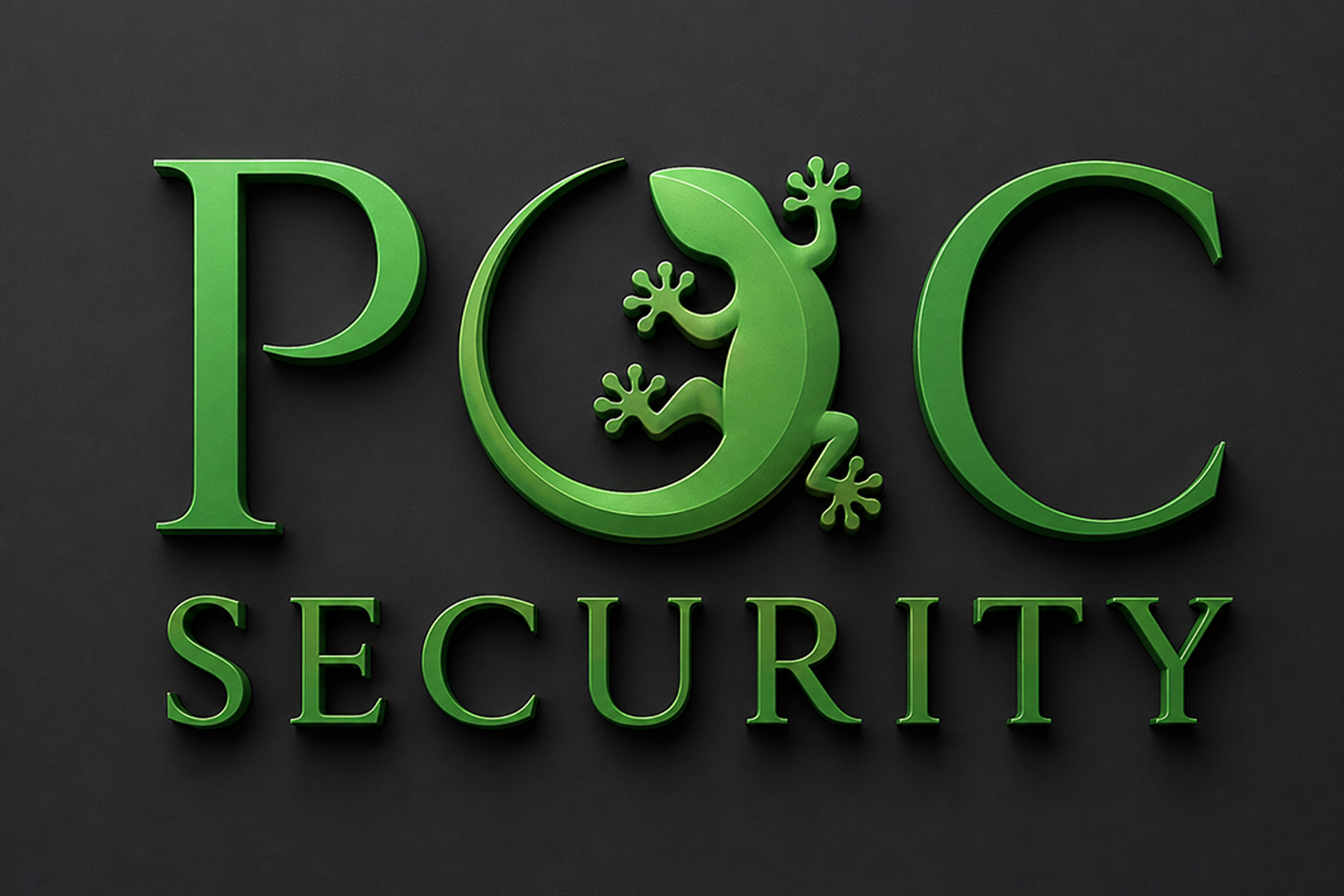
The primary mark pairs the POC wordmark with a stylised gecko replacing the letter O with SECURITY set below in wide letter-spacing.
The gecko is the brand’s distinguishing device: a small, watchful creature that quite literally “holds its ground,” echoing the company’s promise of protection close to home.
Colour System
One confident green, built out
Anchored by charcoal for authority and off-white for clarity with usage weighted roughly 60% neutral, 30% green, 10% charcoal, so the brand reads calm and uncluttered rather than heavy.
Signal Green
#428A1A
Logo, headlines, icons, CTAs
Highlight Green
#58B14F
Gecko highlights, hover states
Deep Forest Green
#295204
Backgrounds, panels, footers
CHARCOAL BLACK
#1E1E1D
Dark backgrounds, primary text
OFF-WHITE
#F5F5F5
Page backgrounds, cards
Typography
A firm handshake, then plain speech
A refined serif carries the logo and major headings for a trustworthy, established feel paired with a clean geometric sans-serif for everything that needs to be read fast.
Tone Of Voice
Speaks the way the technicians work
DO
- Your safety. Our priority.
- Give us a call, we're happy to walk you through your options.
- Solutions you can trust, installed by people you can talk to.
DON'T
- Don't wait until it's too late!
- Leveraging industry-leading security infrastructure...
- #1 in the country," "unhackable," "100% guaranteed.
What Was Delivered
A complete, usable system — not just a logo file
Plain-spoken, reassuring rather than alarmist and personal. Copy that reads like it comes from someone who’ll actually show up.
Primary & secondary
logo lock-ups
For dark and light backgrounds, with defined clear space rules
A five-colour palette
With hex and CMYK values and specified usage ratios
A two-typeface system
Serif for the wordmark, geometric sans-serif for headlines and body copy
A documented tone of voice
Plain-spoken, reassuring, personal, with real do/don't copy examples
Imagery & iconography direction
Real installed equipment over stock photography, single-weight line icons, the gecko as a restrained accent motif
A full brand guideline document
A reference the client (and any future designer) can use consistently