
CASE STUDY
BUCKWHEAT BAKERY
A strong logo doesn’t always need to be complicated. Sometimes the best identity comes from taking something fundamental to the business and giving it a new visual meaning.
The Idea
Start with what's already true about the business
Colour Palette
Warm, earthy and a little premium
Warm, earthy brown tones represent natural ingredients, wholesome baking and the organic qualities associated with buckwheat . A darker base adds contrast and a more artisanal feel.
Roasted Cacao
#4a2e1d
Darker base
Contrast & premium feel
Toasted Buckwheat
#8a5a34
Core mid-tone brown
Warm Caramel
#c08a4e
Accent highlights, warmth
Wholemeal Cream
#f2e4d0
Backgrounds, breathing room
Typography
A signature, not a stamp
The primary typeface is deliberately playful and expressive handwritten, signature-like character that communicates something particularly important for an artisanal bakery: a personal touch in every order.
The Design Language
Every choice traces back to the story
Natural ingredients
Earthy colour palette
Buckwheat seeds
Heart-shaped brand mark
Handmade quality
Signature-style typography
Artisnal Personality
Playful lettering
Built To Travel
Warm and handcrafted — everywhere it needs to work
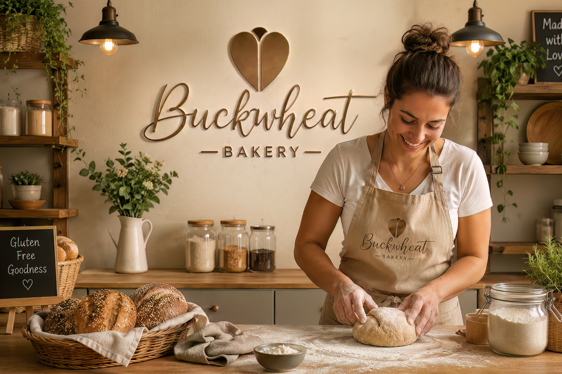
The result is an identity that feels handcrafted and personal, while remaining distinctive and sophisticated enough to travel across every brand touchpoint.